7 tips for good typography
What is the quickest way to see if you are working with a skilled designer?
Typography.
A well trained designer will know how to select quality typefaces and use them correctly.
They consider the aesthetic, appropriateness and tone.
Typefaces, like people, have different personalities.
What is good typography and why is it important in my branding?
Typography is defined as the art, style and appearance of arranging letters in a way that makes the copy legible and clear.
Typography is vital to good design because it is how your brand is communicated to your audience.
Using typography correctly is the best way to communicate your message. Your typography should be legible, clear, and visually appealing and appropriate for your brand tone.
What is the difference between a typeface and a font?
A Typeface refers to the specific design or style of lettering in the alphabet. Each typeface is identified by name. For example Baskerville, Futura and Helvetica are some well known typefaces.
A font refers to one style, weight or size of a particular typeface.
A typeface is the family and style and the font is the variation of that style.
For example Garamond is the typeface and Garamond Roman, Garamond Italic, is the font.
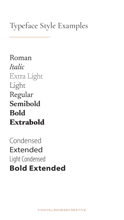
Here are some other examples of styles in a typeface.
Roman
Italic
Thin
Light
Regular
Semibold
Bold
Extrabold
Condensed
Extended
Light Condensed
Bold Extended
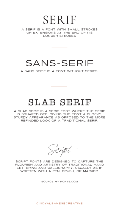
There are four different font categories. They are serif, san serif, slab serif and script (decorative).
7 Tips for good typography
01. Legibility
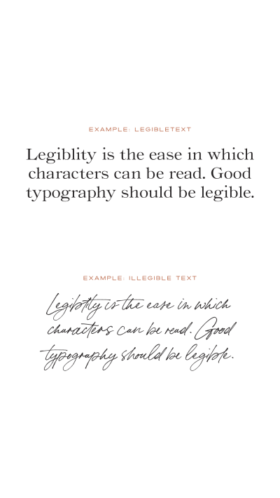
Legibility - Is the ease in which characters can be read. Good typography should be legible. Avoid anything that is overly decorative, cutesy, stylized or hard to read.
Avoid using all caps in the body copy.
Choose the correct point size. Body text should be 9-12 points.
Choose the correct line length. Lines should have 7-10 words.
02. Hierarchy
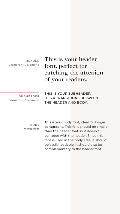
Hierarchy refers to the overall levels or size of typography. It includes headlines, subheadings and body text.
03. Contrast
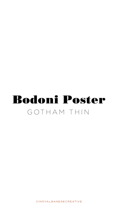
Contrast is the difference between font styles. Choose two fonts with varying weights, like a thick serif paired with a thin san-serif.
04. Alignment
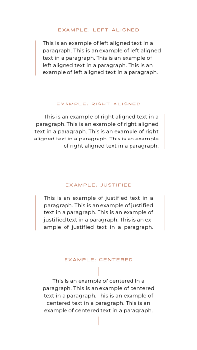
Alignment refers to the placement of the type or image on the page or column. The four basic alignments include left, right, justified and centered. Left alignment is best in most cases as it's easy to read. Avoid centering long blocks of copy.
05. Whitespace
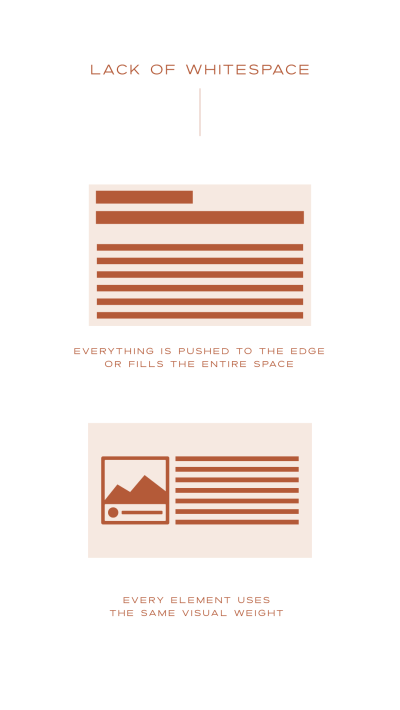
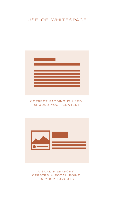
Whitespace or blank space is the area(s) of a layout that are free of type and graphics. Using whitespace and margins helps create harmony and balance. It also improves the readability and scannability of your layout and creates a focal point.
06. Kerning
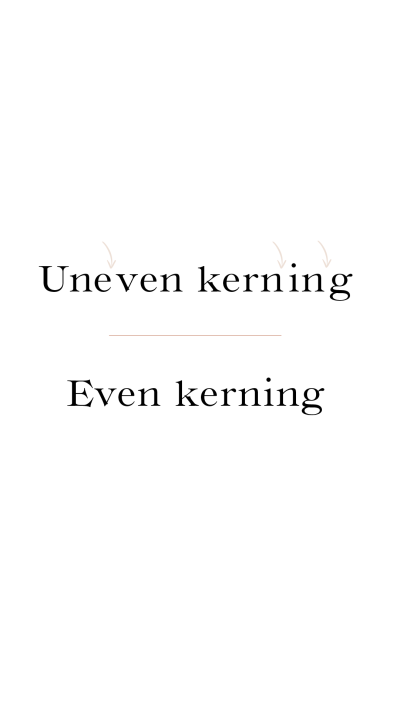
Kerning is the spacing between each letter. Each space should visually look the same.
07. Spacing
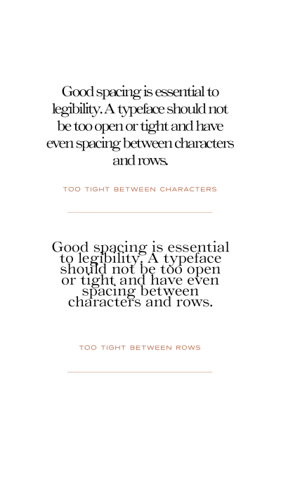
Good spacing is essential to legibility. A typeface should be well spaced. It should not be too tight or too open and have even spacing between characters and rows. Here are some examples of typefaces that are too tight between characters and rows.
Using these tips will help your typography to be more legible, visually appealing and easily communicated.
Send me the free guide
I created this free guide to use as a reference. It includes these 7 tips for good typography.

