Crafting a compelling brand is vital to the success of your business. Avoid these five common pitfalls and create a memorable brand that stands out from the competition.
Here are five common branding mistakes to avoid.
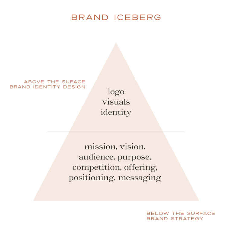
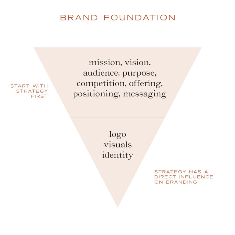
1. Skipping Brand Strategy
A brand that is not based on strategy does not have a clear vision.
So what is brand strategy?
Brand strategy is the foundation for your brand. It includes your mission, visual identity, audience, purpose, offerings, competition and messaging. It should be the first thing to consider before you begin the design process and it should influence your visual identity.
Start by asking yourself these three questions about your brand:
Who are you?
What do you do?
Why does it matter? (What problem do you solve).
Remember is it not about you, it is about your audience.
Who is your customer?
What is your offering?
How does it help them?
Is this message reflected in all communications you have with them?
Brand Strategy is often overlooked because it is the most difficult to figure out. Starting with a good foundation is vital for clear direction and focus when building your brand. Spend time on this important step, so that you won’t have to revisit and revise your brand visuals in the future.
All of the foundational elements should influence your brand visuals
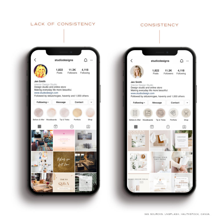
2. Lack of Consistency
Consistency builds trust. Having a consistent brand helps build trust with your audience.
Using too many different fonts, colors and styles will make your brand feel inconsistent and look messy. It will leave your audience feeling confused about who you are and what you stand for.
Brand consistency ensures that all of your elements are easily recognizable across all platforms and touch points.
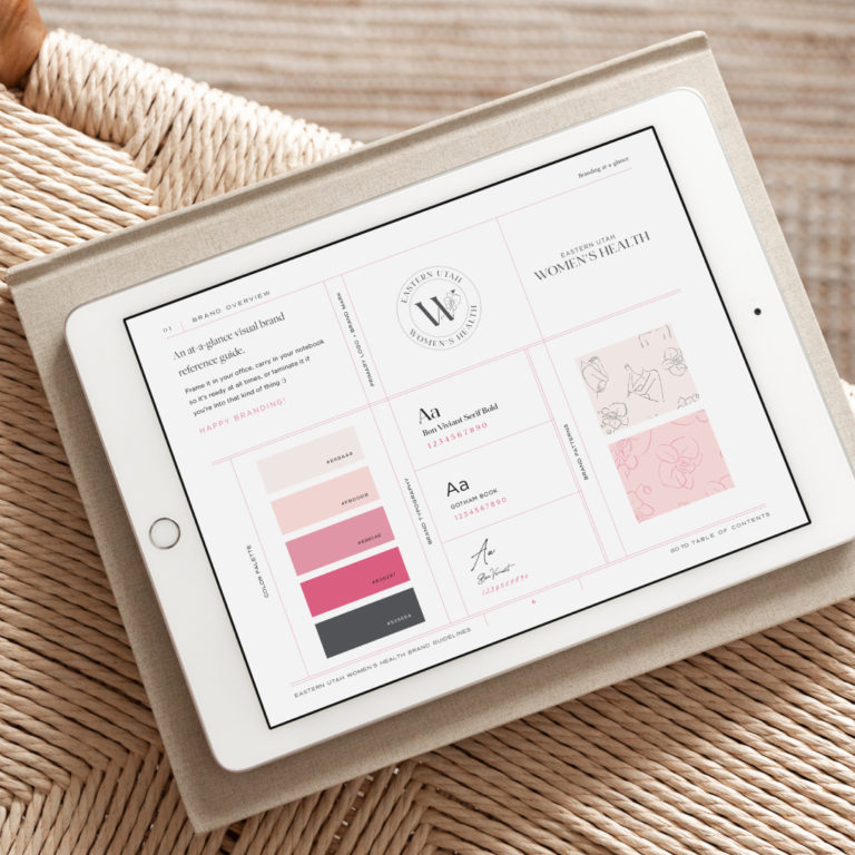
Brand guidelines are vital to maintaining consistency. Whether you are just starting out or have a large company, brand guidelines will be the key to maintaining a consistent visual style for every element of your brand.
Your brand guidelines should include brand tone and rationale, logo usage (primary, secondary and brand submark(s), spacing and sizing guidelines, file types and color modes, typography and color palettes.
This framework will guide anyone who uses your brand elements in the proper way.
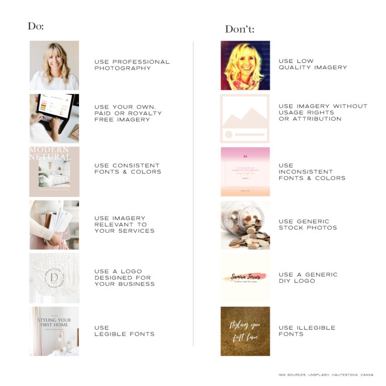
3. Lack of Professionalism
Visuals are the face of your brand. You might have an incredible product or service, but if you are not representing it in a professional way, you won’t be taken seriously.
Do you want to put your trust and investment into a brand who isn’t willing to invest in themselves?
Do
Use professional photography
Use consistent fonts, colors, photography styles, etc.
Use your own, paid or royal free imagery.
Use imagery that is relevant to your services or offerings.
Use legible fonts
Don’t
Use a low res, poor quality imagery (that selfie you took five years ago)
Use inconsistent fonts and colors (don’t pick whatever is trending right now)
Use a generic, stock or DIY logo
Use imagery without usage rights or attribution (just because it is on pinterest doesn’t mean it’s free to use)
Use generic stock photos
Use illegible fonts
If your branding isn’t legible, relatable for your business or doesn’t communicate your core values, you have missed the mark.
4. Following Trends
Trends will come and go, but your brand should be able to stand the test of time. A good brand identity should:
Be unique and timeless
Reflect your vision and values.
Work is black and white.
Provide flexibility across all applications.
Stick with what is relevant to your core brand values. Serve your audience. Remember it’s not about you, it’s about them.
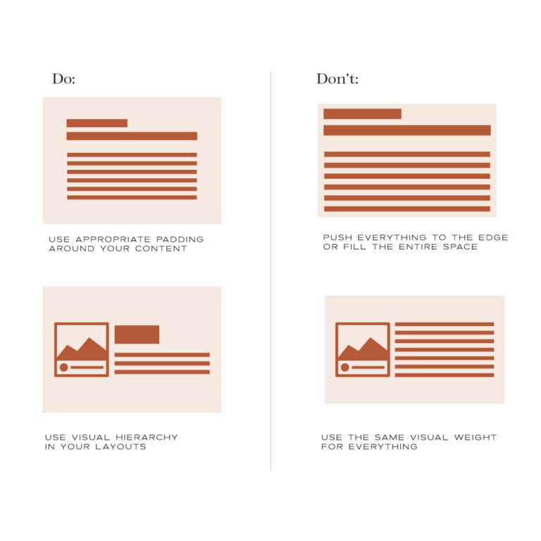
5. Overcomplicating Design
Avoid visual clutter. Keep it clean and easy to read and understand. Use whitespace and margins to help create harmony and balance. Make it more legible and scannable and create a focal point.
Do:
Use appropriate padding and margins around your content.
Use visual hierarchy to create a focal point.
Don’t:
Push everything to the edge of the page.
Fill every square inch of space.
Use the same visual weight for everything.
Remember a brand is more than just a logo. It is the experience and connection your audience or customer has with every interaction.
I hope you found this information helpful. My goal is to guide you through the design process and help you develop a brand that is cohesive and thoughtful to connect with your audience.
Good design builds trust.
The more trust you have with your audience the more likely they are to connect with, and want to work with you.
Brand visuals are the first touchpoint for your business. You want to make a good impression. Does your branding look professional and polished? Is your message clear and focused? If not I can help.