Ayora Wellness is an aesthetics and wellness center located in Heber, Utah. They provide botox, laser treatments, vitamin infusions, skincare consultations and laser hair removal.
The target audience of Ayora are mature, well established and adventurous. They love the outdoors, support humanitarian efforts and value integrity.
The mission and goal of Ayora is to help their clients look and feel their very best.
Scope of Work
Brand Identity Design
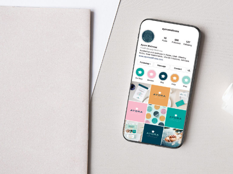
Social Media Templates
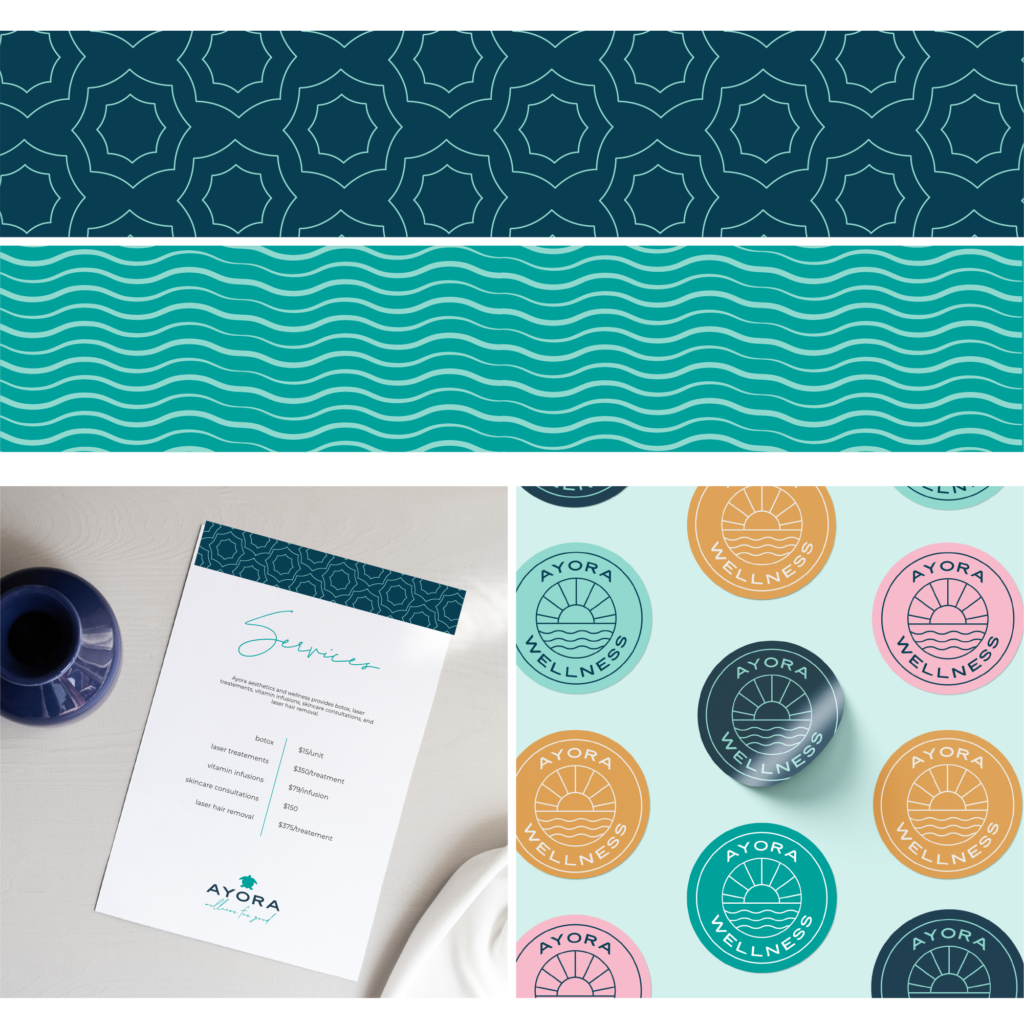
Pattern Design
Business Cards
Website Design
Ayora Wellness needed a more refined brand and a recognizable and distinct look. They wanted something that reflected their level of business expertise, humanitarian efforts and adventurous clients.
Bryce and Ali Craven were inspired when they traveled to a beautiful town in the Galapagos islands called Puerto Ayora. They fell in love with the beautiful people, beautiful beaches, animals and culture. Ayora reminds them of the inner and outer beauty of Ayora.
A portion of their profits will help fund humanitarian efforts in developing countries in Latin America.
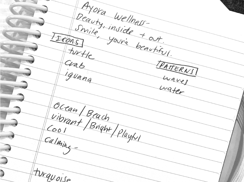
The brand values are integrity, generosity, adventure and expertise. They want their clients to feel relaxed, comfortable and excited.
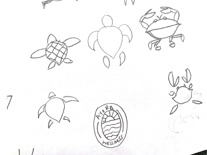
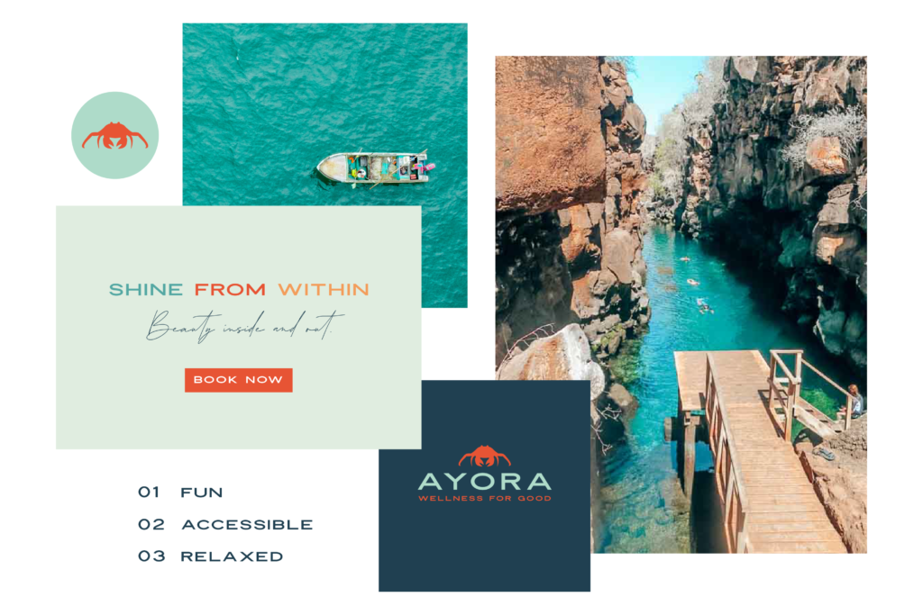
Bryce loved the idea of having an animal for the logo. After researching the animals of the Galapagos islands, we narrowed it down to a crab, turtle, or iguana. We also wanted to incorporate water into the branding elements.
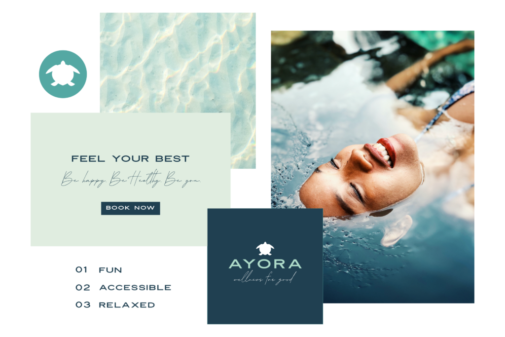
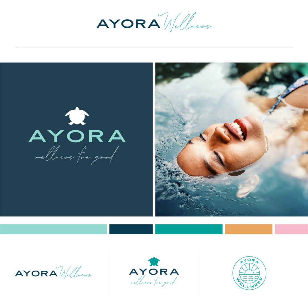
After exploring several options for the animal icon, the turtle felt the most in line with the brand mission and business category.
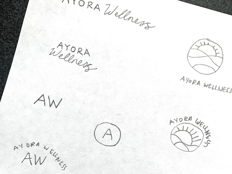
The primary and secondary logos are inspired by the inner and outer beauty of the people, beaches, animals and culture of the Galapagos islands.
The colors are bright, playful and energetic. The blue represents calmness and serenity. The orange represents joy and sunshine and the pink represents health and playfulness.
The two typefaces selected are classic, fun and relaxed. They convey the accessible, adventurous and fresh tone that Ayora is known for.
The logo is meant to be fun, playful and energetic. It is designed to be used in multiple colors and applications to show the variety, whimsy and excitement of the brand.
The patterns represent the ocean and the energy of the people of the Galapagos islands.
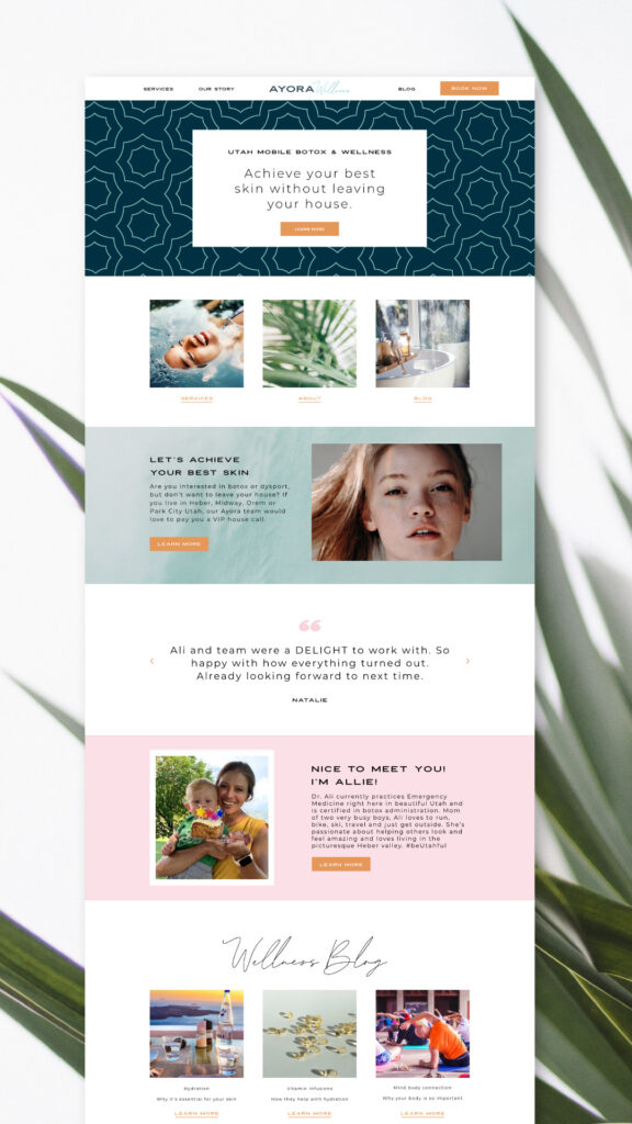
After completion of the brand identity, the client wanted to expand the branding with an updated website design. I created the framework for this.
The pages were built based on templates that could be easily modified from page to page.
Cindy is extremely talented, easy to work with, and a great communicator. Her design process is unique and collaborative. We are super happy with how things turned out!
My website uses cookies to deliver better user experience. By using my site, you consent to the use of cookies.