Color Theory - Choosing colors that work well together.
Color Theory is a set of rules and guidelines used to create harmonious color combinations.
It is based on the color wheel and provides guidance when mixing colors.
Color theory is an important aspect of design to consider for your brand. Colors are remembered more easily than words or shapes. Using color consistently in your branding and marketing will help you to be more memorable, recognizable and trustworthy.
Color is fundamental.
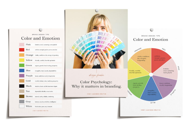
Color is fundamental to our experiences and perceptions of the world around us. Colors can have a lasting impression and elicit a wide range of emotions making it an important thing to consider when using it in your visuals.
Have you ever noticed how certain environments affect your emotions? Think about how you feel when you walk into a spa. The colors are cool, muted, calm and peaceful. You feel relaxed, comfortable and at ease.
Now compare that to how you feel when you walk into a fast food restaurant. The colors are warm, vibrant and exciting. You feel stimulated and energized.
Colors can, not only affect our mood, but can have even been used for healing purposes. Chromotherapy, or color therapy has been used for decades as a treatment to help heal diseases.
In chapter 7 of the book drunk tank pink, the author Adam Alter talks about color. He looks into different color studies and how they effect human behavior. A few examples include how blue lights reduced criminal activity, how color treatment (aurora color films) helped depressed patients. How painting the walls of a prison cell a certain shade of pink actually helped to calm violent prisoners.
He says color plays a powerful role in the human decision making process for two reasons.
Color effects us physically.
We associate colors with almost every imaginable pleasant and unpleasant object that populates our planet.
So where do I start when it comes to choosing colors?
Looking at the color wheel can help you quickly understand what color theory is all about and how different colors work together.
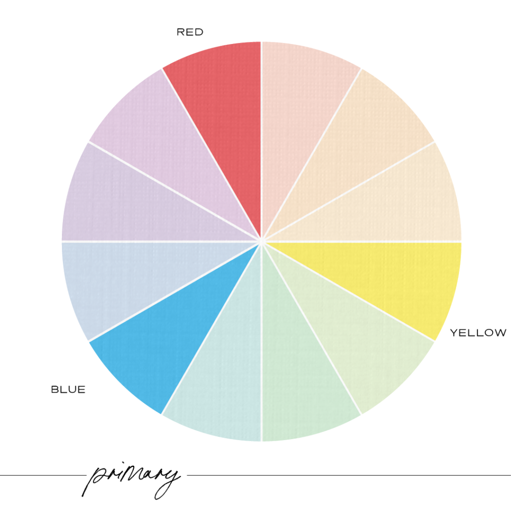
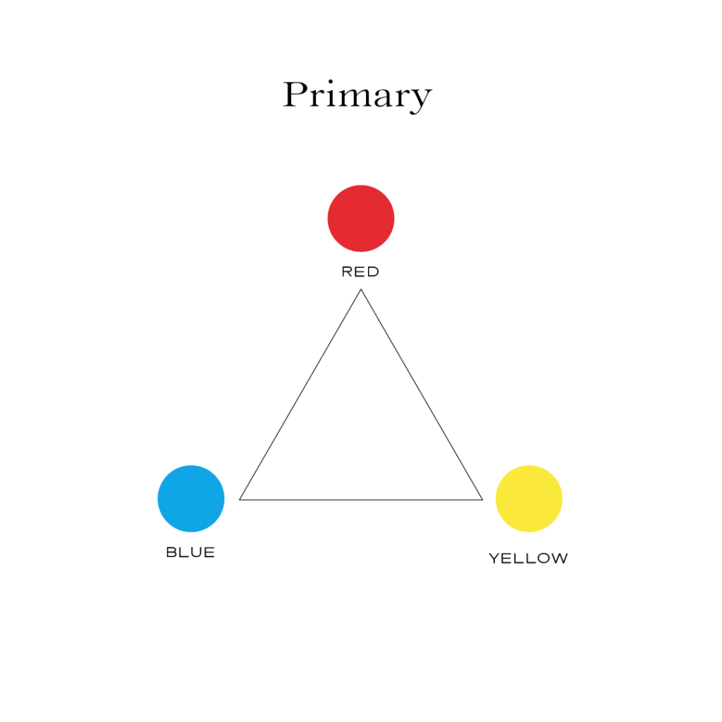
The traditional color wheel which was first invented by Sir Issac Newton in 1666, shows the relationship between colors. According to this traditional color wheel, the Primary Colors are Red, Yellow, Blue. These three colors are mixed together to all of the other colors.
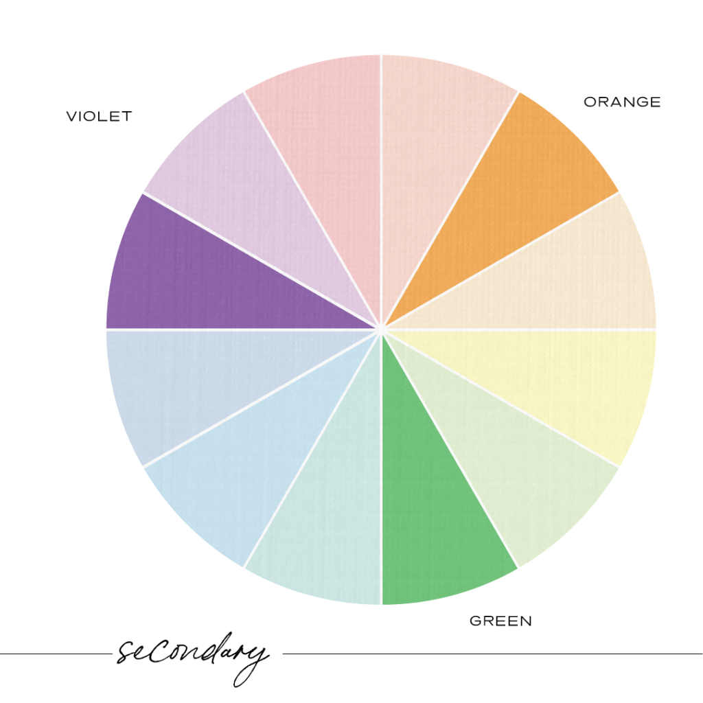
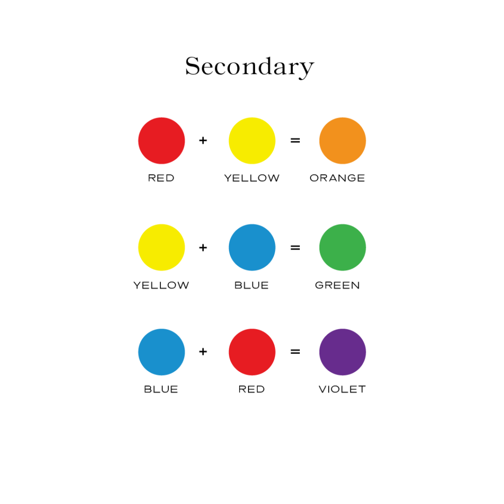
The Secondary Colors are Orange, Green, Violet. These colors are created by mixing the primary colors together as shown.
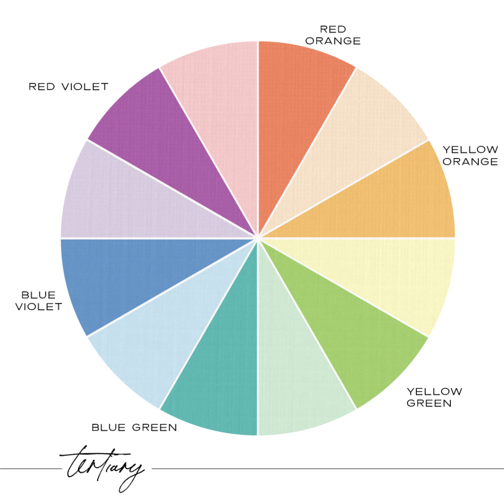
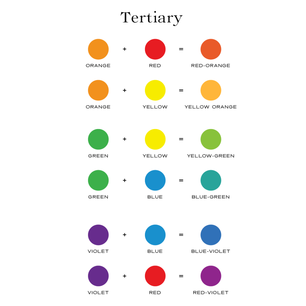
The Six Tertiary Colors are Red-Orange, Yellow-Orange, Yellow-Green, Blue-Green, Blue-Violet, Red-Violet, which are formed by mixing a primary with a secondary.
This traditional color wheel shows the relationship between colors and why certain colors work better together than others.
When we look at other applications for color there are two things that need to be considered. That is colors of light versus the colors of printing.
Red, green, and blue (RGB) are the primary colors of light.
This additive color mode uses red, green and blue. This is best used when working with computer screens and lights. Examples include websites, social media, emails, on-screen ads and television. This color mode is used in psychics and light.
Cyan, magenta, yellow and black (CMYK) are the primary colors of printing.
This subtractive color mode uses cyan, magenta, yellow and black.
This is used for printed materials like flyers, business cards, packaging, brochures and merchandise. This color mode is used by artists and designers when mixing paints and colors and produces a better range of colors.
Color Terms
The four main qualities of each color are Hue, tint, tone and shade.
Hue (another name for color) is the color in its purest form. You would refer to red as a hue.
Tint - is a mixture of a color with white, which increases lightness.
Tone - is the color that appears on the surface.
Shade - is a mixture of color with black, which increases darkness.
Saturation - is the intensity of color. The more saturated the color is the more vibrant it appears.
Value - is how light or dark the color is.
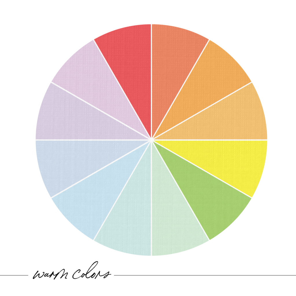
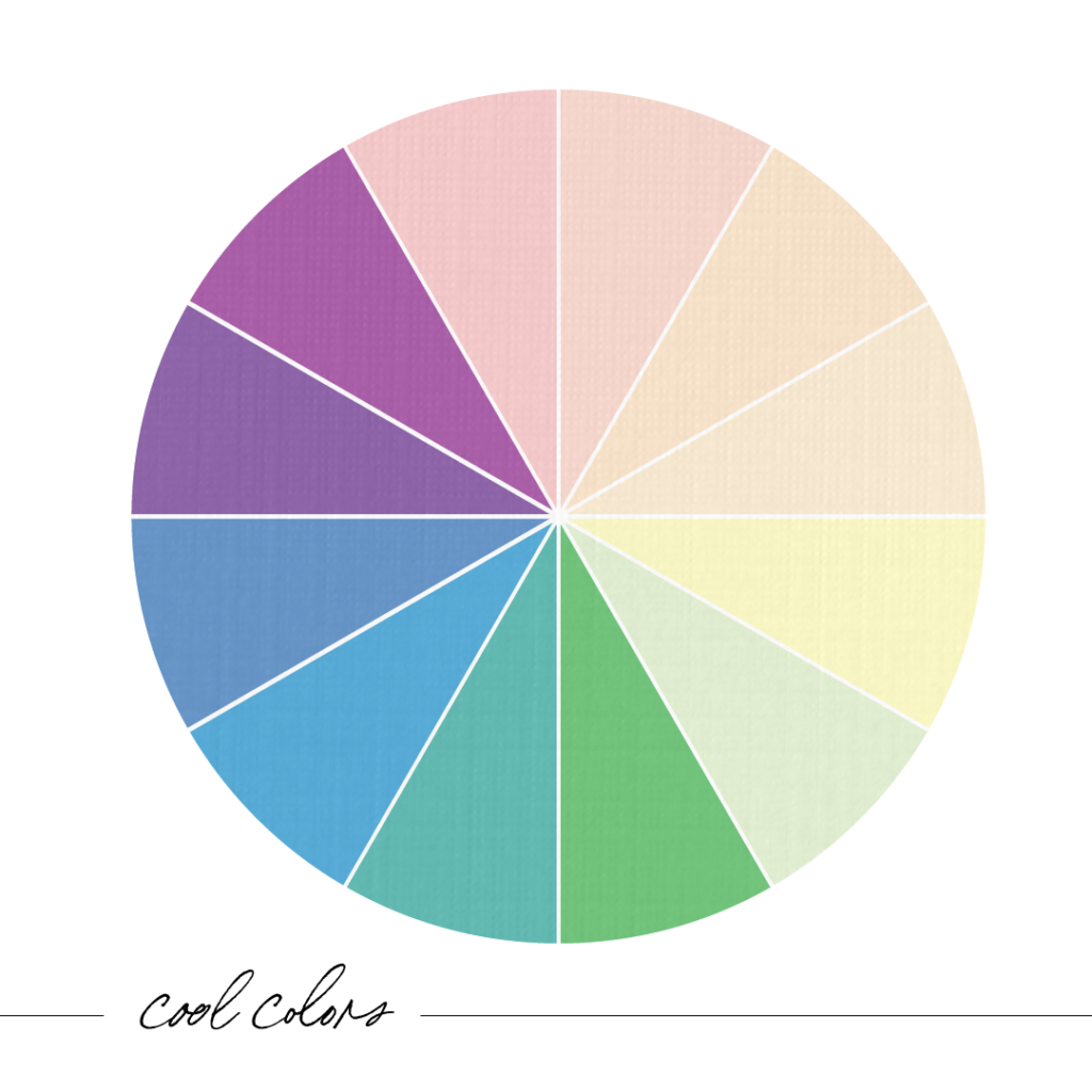
Temperature - warm vs cool colors.
Warm colors (red, yellow and orange) can create feelings of comfort, energy, excitement or even hostility.
Cool colors (blue, green, purple) can create feelings of calmness, restfulness or even depression.
Palette - group of colors used to describe a mood or theme.
So now that you have a basic explanation of color properties and terms, here are some color schemes to use for selecting colors that work well together.
Monochromatic - One color. Monochromatic color schemes use different tones of the same color.
Complementary - Two colors opposite each other on the color wheel.
Some examples of complementary colors are:
Red and green
Blue and orange
Yellow and purple
Split-Complementary – One primary color and two colors adjacent to it on the color wheel.
The 12 split complementary color schemes are:
Red + Blue-Green + Yellow-Green
Orange + Blue-Purple + Blue-Green
Red-Orange + Blue + Green
Red-Purple + Yellow + Green
Yellow-Orange + Purple + Blue
Yellow-Green + Red + Purple
Yellow + Blue-Purple + Red-Purple
Green + Red-Orange + Red-Purple
Blue + Red-Orange + Yellow-Orange
Blue-Green + Orange + Red
Blue-Purple + Yellow + Orange
Purple + Yellow-Orange + Yellow-Green
Following the 80/20 rule with the dominant color ensures the design looks visually appealing and not too busy.
Analogous – Three colors that are next to each other on the color wheel.
Some examples of analogous colors are:
Green, yellow-green, yellow
Yellow-orange, orange, red orange
Red, red-violet, violet
Blue-violet, blue, blue green
Triadic – Three colors distributed equally around the color wheel.
Some examples of triadic color schemes are:
Red, Yellow, and Blue.
Purple, Green, and Orange.
Blue-Violet, Red-Orange, and Yellow-Green.
Red-Violet, Yellow-Orange, and Blue-Green.
Tetradic – Four colors distributed equally around the color wheel.
Some examples of tetradic color schemes are:
Red, orange, green, and blue.
Yellow, orange, blue, and purple.
Red-orange, yellow-orange, blue-green, and blue-purple
Blue-purple, red-purple, yellow-orange, and yellow-green
Now comes the fun part. Playing with colors, seeing how they work together and applying them. When I am creating a design I always start in black and white first so that I don’t get distracted by color. A good design always starts with a solid foundation. Here are some tips to get you started:
Pick one dominant color. One dominant color will create a sense of balance in your design. Use the rules of color harmonies to find the other accent colors.
Use 2-3 accent colors. Use just a few colors. Simple is best. Using too many colors will become overwhelming and chaotic.
Design seeds – Images with color swatches. Great for mood boards and inspiration.
Coolors – an interactive color generator. Easily add, copy, move or change colors. You can upload a photo and generate colors from it.
ColourLovers – Creative community where artists share color palettes.
Colorhunt – pre-made color palettes. Search by name, style or color.
Color By Farados – Chrome extension that pulls colors from the web and helps you find matching colors.
Remember the color wheel is a guide to use as a framework to understand how colors work well together. If you want something more personalized for your brand, let’s work together.
Read more about color psychology and how each of the colors evoke certain emotions here.
Send me the free guide
Color Psychology and why it matters in branding.
My website uses cookies to deliver better user experience. By using my site, you consent to the use of cookies.