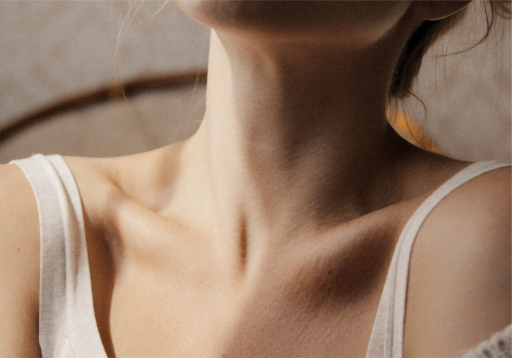
Eastern Utah Women’s Health is a comprehensive healthcare clinic who provides high quality healthcare to all women. The clients at Eastern Utah Women’s health are accepted regardless of background, age or ability to pay. They are heard, cared for and leave feeling better than when they came in. They are hopeful and optimistic about their health.
Scope of Work
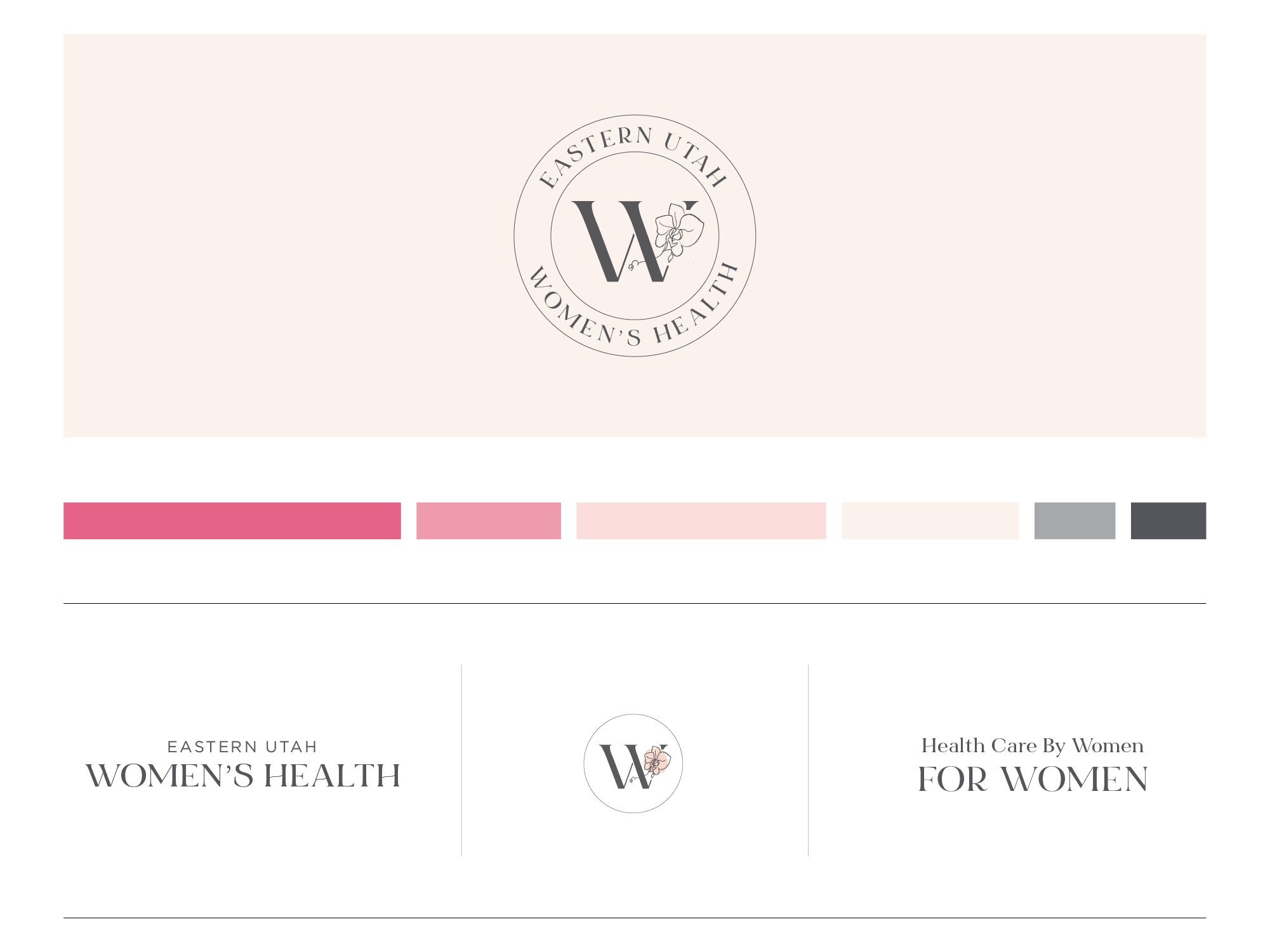
Brand Identity Design
Social Media Templates
Pattern Design
Business Cards
Eastern Utah Women’s Health needed a more professional and timeless brand look, but wanted to keep some elements from the existing branding. They wanted to maintain the pink color palette because of the feminine nature of the color. They also wanted to keep the letter W inside the circle (so their clients would still recognize them). They wanted the brand to feel inviting and accessible. They wanted to avoid perfectionism and make the branding approachable.
The unique characteristics of the brand include:
Healthcare for women by women
Only women’s clinic in Eastern Utah
Team of kind, caring and compassionate women who are organized and ready to help
The tone for the brand is
Calm
Natural
Romantic
Bohemian
Vintage
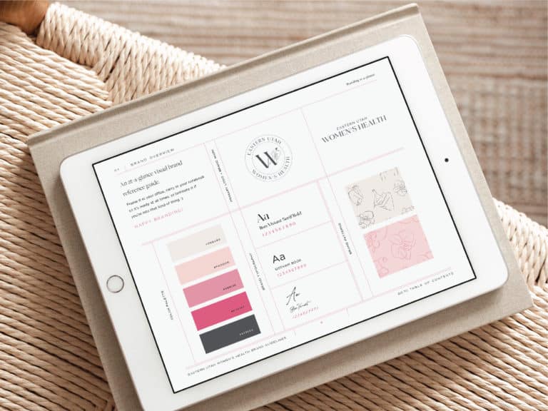
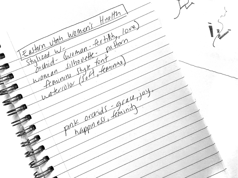
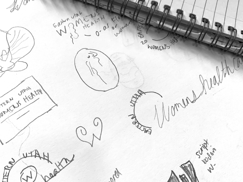
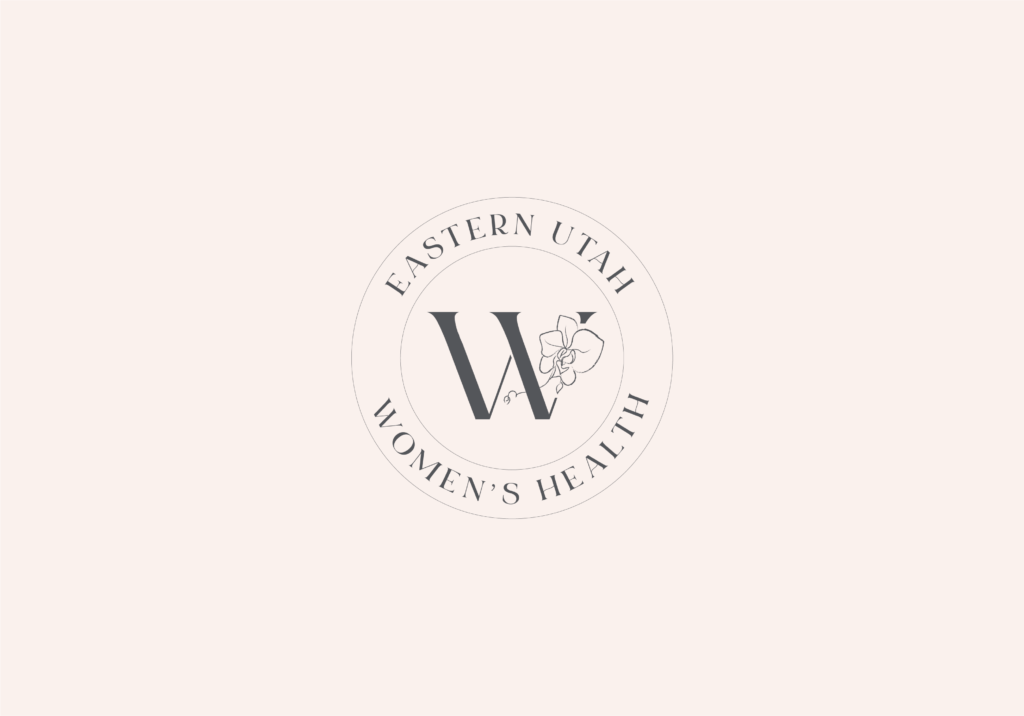
The logo is inspired by strong, graceful and empowered women. The orchid symbolizes grace, joy, happiness and femininity. The orchid and the woman silhouette is used as a pattern element throughout the branding.
The typography was selected because of the rounded elements that feel soft and delicate. The secondary typeface adds professionalism and timelessness.
The color pink was chosen because it represents the target audience of women. It conveys calming, femininity and kindness. The color palette is monochromatic with gray accents.
The new branding for Eastern Utah Women’s Health bridges the gap between the old and new brand. The elements of the old brand remain the same, but the updated style is more timeless and fitting for their target audience. They now have brand guidelines they can use to create and maintain a cohesive brand. They also have social media templates that can be easily modified and re-used.
Cindy took to the time to understand my business and the women we are trying to reach. The branding package she created is outstanding and really captured the essence of who we are. Cindy made the experience easy and joyful!
My website uses cookies to deliver better user experience. By using my site, you consent to the use of cookies.