Your branding should include more than one variation of your logo.
Why you might ask? Because there are different applications where different variations of your logo are appropriate to use. Having multiple versions of your logo can help keep your brand looking consistent across all platforms while adding flexibility for each use case. This way you won't have to shrink or stretch your logo. The logo should be formatted to fit the space available. It is important to have options to use for different scenarios and use cases.
Let’s look at some examples.
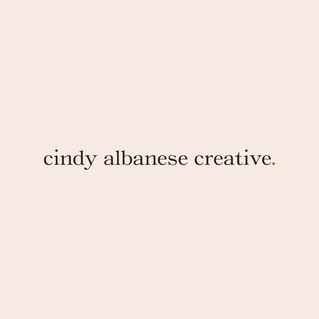
01. Primary Logo
Your primary logo is the main identifying mark for your brand. It is the one that will be most widely used. It is usually the most detailed version of your logo. It should include your full business name. It can also include an icon, established date or tagline. Usage examples include the header of your website, marketing materials, brand collateral, etc. It is the main logo used to represent your brand.
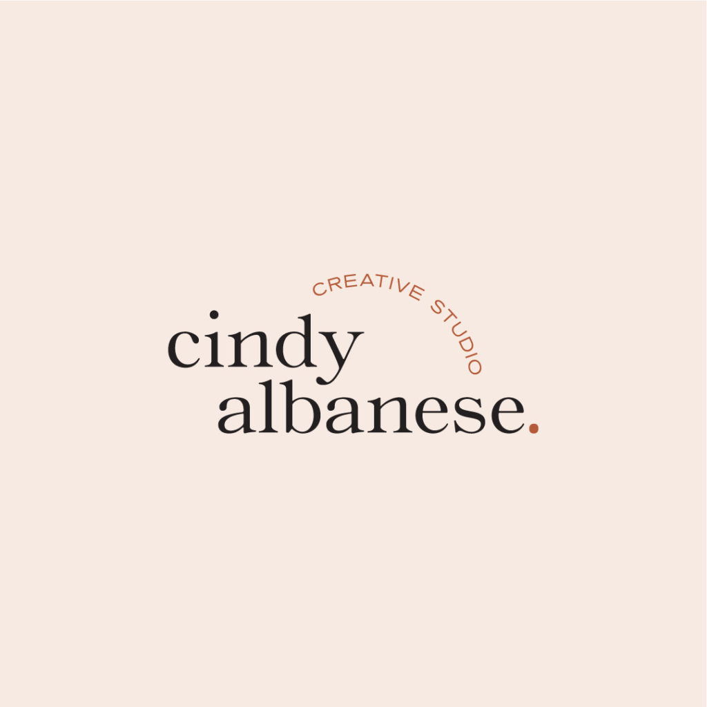
02. Secondary Logo
Your secondary logo is an alternative logo that uses elements of the primary logo arranged in a different composition. It provides more flexibility to use your logo in different design settings. Usage examples could include social media profile image, stamps, stickers, detail on printed materials, to create texture, etc. This logo can be a more simplified version of your primary logo that can be used at a smaller scale or in a different orientation.
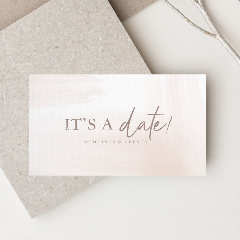
Having a horizontal and vertical version of your logo allows for flexibility. The horizontal version usually works better on a website header or business card, while the vertical version works better on social media, stamps or stickers.
03. Submark
A submark or brandmark Is the most simplified compact mark. It often pulls in icons or initials that can stand alone as an identifying mark. It is often a simple icon or monogram that can be scaled down to be used in places where the primary logo would not be recognizable at such a small scale. Some usage examples would include website favicon, social media profile image, branded stickers or stamps, to add detail on printed materials or to create texture.
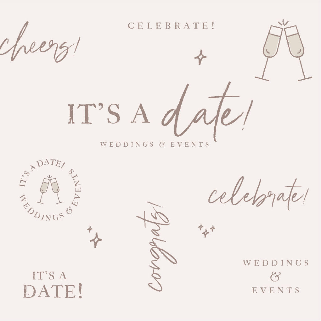
04. Brand Elements
Some other elements that can be added to your branding are patterns and icons. These custom visuals add more life and variation to your brand while still maintaining consistency..
Patterns
Patterns are a fun and unique way to add personality to your brand. Patterns can be used in branded collateral such as on your business card, pdf designs, social media, slides, your website, to add texture, etc.
Icons
Icons are small graphic elements that communicate quickly without words.
Branded icons are another extension of your brand. Having icons that are consistent with your other visual elements is a way to make your branding more personalized and distinctive. They help to reinforce brand recognition and help you stand out amongst your competition. Icons can be used on your website, instagram highlights, brochures, media kits, social media posts, presentations, packaging, etc.
Using your logo consistently and repeatedly will help to build trust with your audience. The more frequently it is used, the more trustworthy you become.
Having brand guidelines will ensure everyone using your logo is doing so correctly.
Here are a few tips for using your logo(s).
Do:
Provide plenty of safe space around your logo. As a general rule the clear space should be the height of the logo around all four corners.
Maintain good contrast between the logo and the background.