Here are five ways to create consistency in your brand.
01. Use Brand Guidelines
Create a consistent visual identity by using brand guidelines. They ensure cohesive and consistent use of your brand elements at every touchpoint. They also guide team members and partners who use your brand assets.
Your brand guidelines should include your logo(s), typography and colors. They can be as simple as one page or more comprehensive and in depth.
Getting started with brand guidelines is easy. I created a free template to get you started.
The brand guidelines I create for my clients include:
Brand Strategy (the rationale behind your brand decisions)
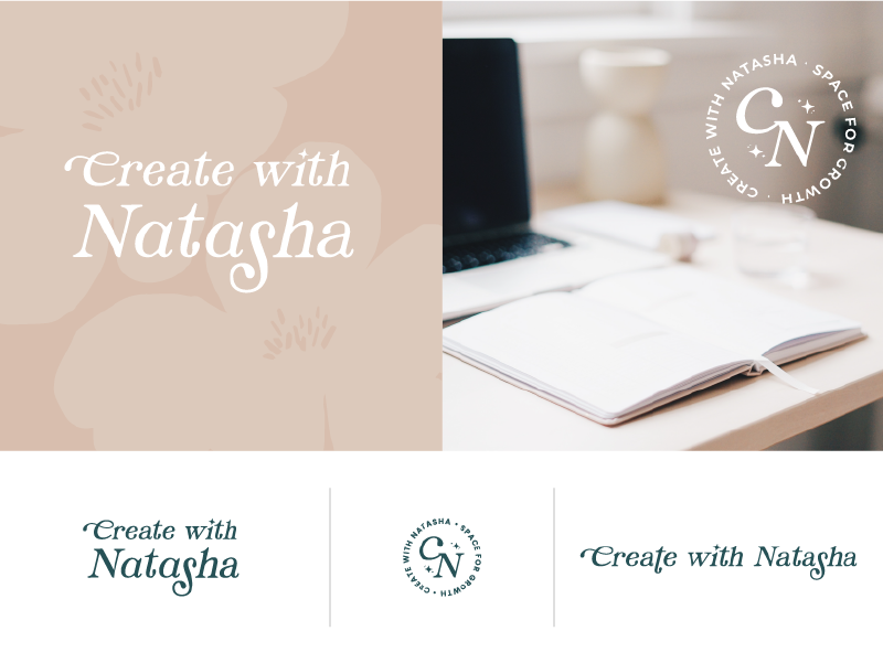
Logo Variations
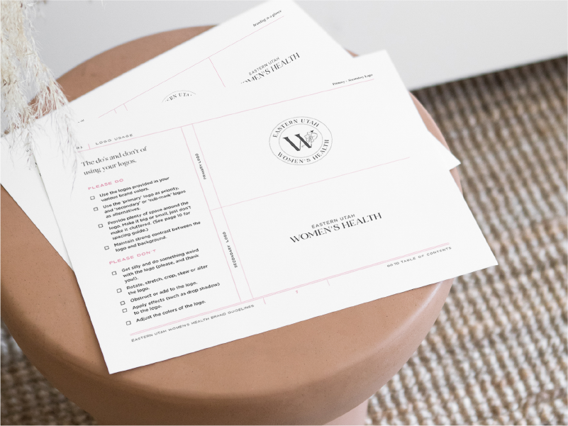
Logo Usage
File formats
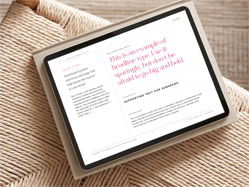
Typography usage and styles
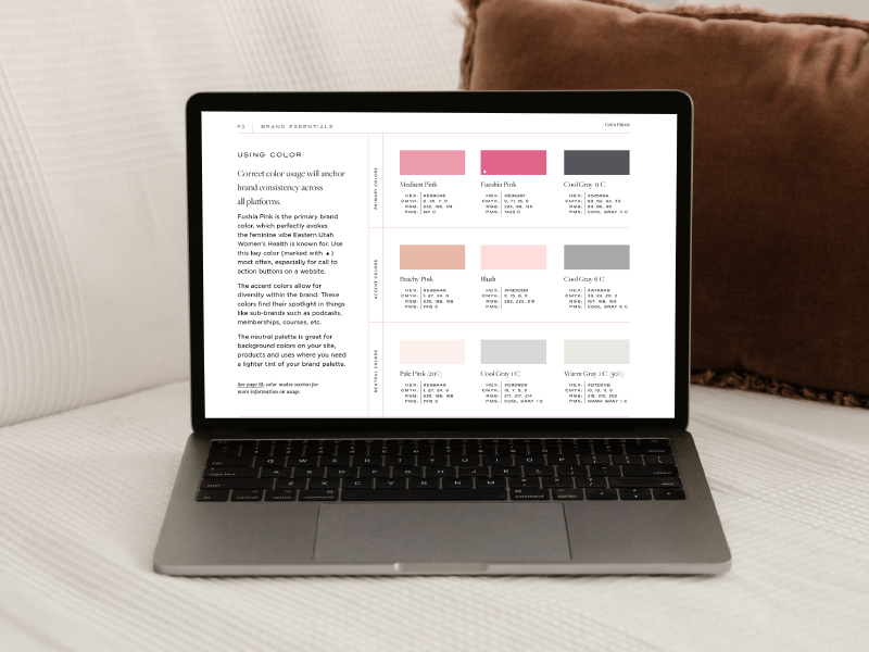
Colors (with hex codes, RGB, CMYK and PMS color values)
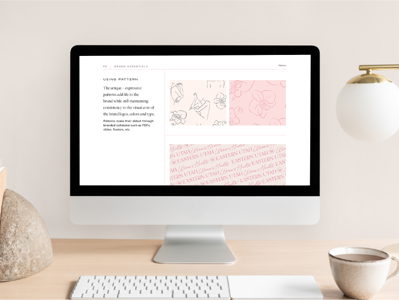
Patterns
02. Use your brand typography
Your brand typography (brand fonts) are the type styles you use for your brand.
Use your brand fonts exclusively and consistently.
The consistent use of your typography creates recognition and trust.
Here are a few tips for using your typography.
Avoid using more than three fonts.
Don’t add fonts that are not included in your brand guidelines. Changing up your font styles will confuse your audience. Too many font styles will look messy and unprofessional.
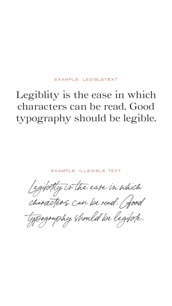
Ensure fonts are legible.
Avoid using all uppercase for large amounts of text. Use sentence case text for better legibility.
Avoid centering large amounts of text. Use left justified text for better legibility
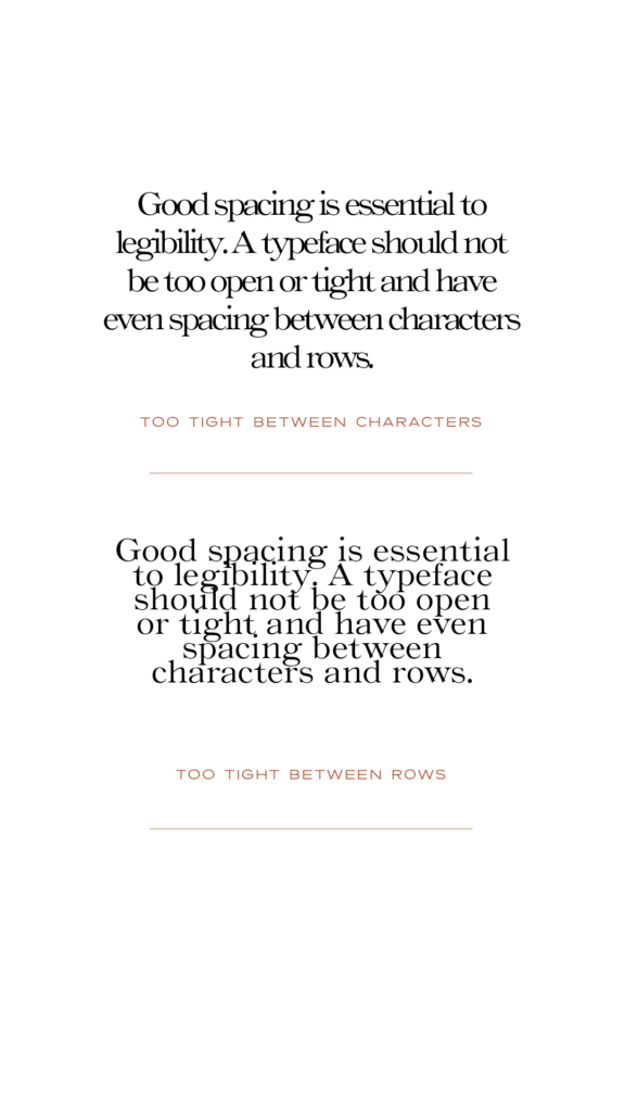
Use proper spacing for better legibility.
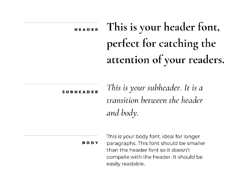
Use type hierarchy to highlight the importance of information. Hierarchy refers to the overall levels or size of typography. It includes headlines, subheadings and body copy.
Read more about tips for good typography and a get the free guide.
03. Use your brand logos
When using your brand logos here are some general rules to keep in mind.
Use proper spacing around your logo. Make sure you include clear space around your logo. Your logos should have a clear space margin equal to half the x-height of the logo. This padding ensures your logo is legible and reads correctly.
Use correct sizing. Make sure that your logo is legible at a small scale. If it becomes illegible, use a brand mark instead.
Use the correct file types and color modes for your logo.
EPS is a scalable vector and is best for printed items.
SVG (scaleable vector) with transparent background. Great for web when transparency is needed..
PNG – Raster file with transparent background. Great for web when transparency is needed.
JPG – Raster file without transparency. Great for web (typically photos).
Don’t stretch, rotate, crop, skew, distort or alter the logo.
Don’t add drop shadows or adjust the colors of the logo.
Use the correct scale for legibility.
Ensure proper spacing around your logo so it doesn’t feel crowded.
Make sure your logo works in black and white. This will help avoid issues when printing in black and white, and on brand collateral such as embroidery, engraving, etc.
04. Use your brand colors
Use your brand colors exclusively and consistently.
Changing up your brand colors will confuse your audience. The consistent use of your brand colors creates recognition and builds trust.
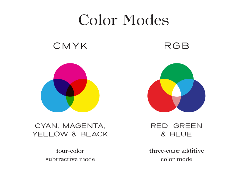
Ensure you are using the correct color format.
CMYK (cyan, magenta, yellow and black) The CMYK color format is used for printed designs. Examples include business cards, flyers and brochures.
RGB (red, green and blue) The RGB color format is for used for screen displays. Examples include web, tv, phone and social media.
Use good color contrast with your typography for legibility.
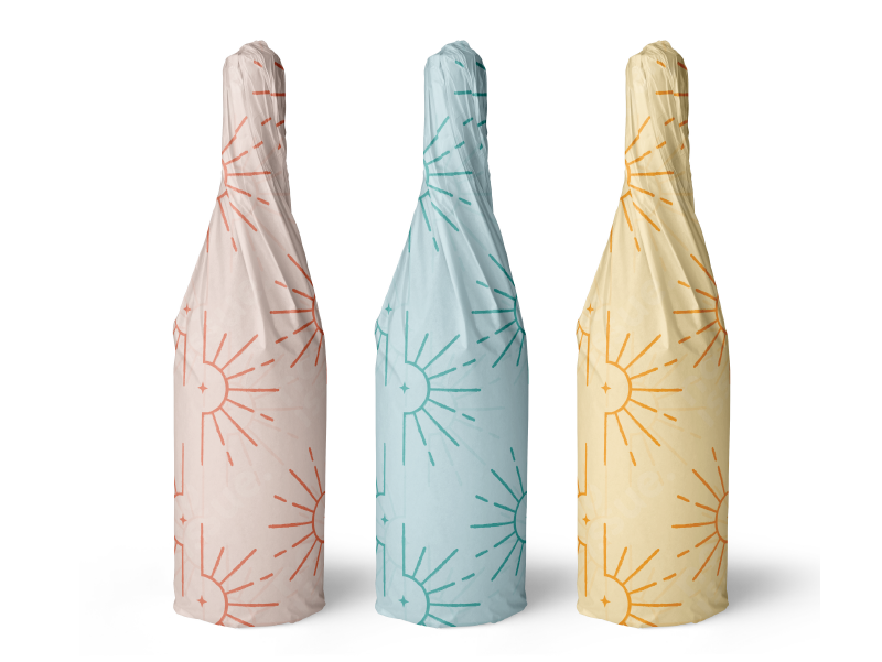
05. Use your brand patterns
Brand Patterns are one of my favorite things to create. Custom patterns are a great way to make your brand stand out. They can be used on packaging, stickers, cards, bags, tissue paper, hang tags, bottles, labels, tape, social media and merchandise.
Using your brand assets consistently helps to build trust and recognition. Need expert help with your branding? Let’s get started.
Hi, I'm Cindy. I'm a branding expert who is passionate about health and wellness.
I’m here to help you build a strategic brand that speaks to the hearts and minds of your ideal clients.