Brand Colors: How to choose the right palette for your brand.
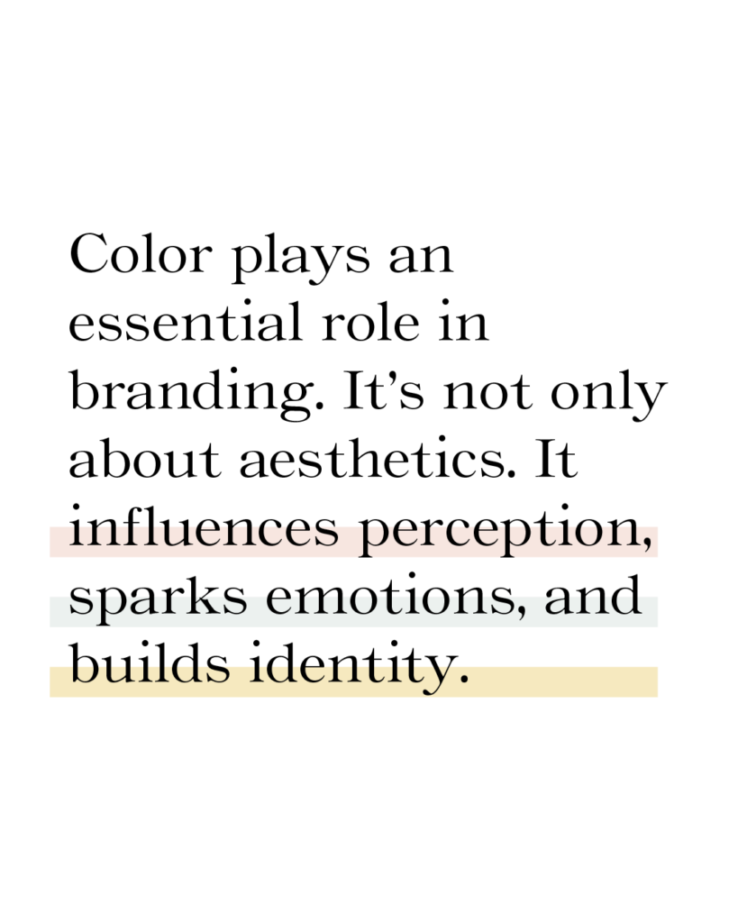
Color plays an essential role in branding. Brand Color isn’t only about aesthetics. It influences perception, sparks emotions, and builds identity.
The right colors will make your brand stand out. Using your brand colors with consistency builds trust. It creates a lasting connection with your audience.
Brand Colors make your brand recognizable
They influence the perception of your brand.
They create a strong first impression.
They evoke emotions.
They create brand recognition.
They set you apart from the competition.
They influence buying decisions.
Brand colors should be thoughtfully considered and based on strategy. Not only personal preference.
The Basics of Color Theory
Ever wonder why some color combinations seem to feel right? That’s the magic of color theory.
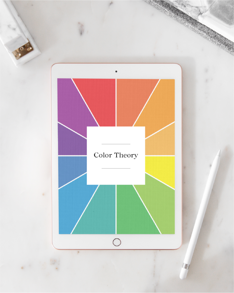
Color theory is a guide to how colors work together. It’s based on the color wheel, which shows primary, secondary, and tertiary colors. Colors can create different moods, evoke emotions, and influence perception. By understanding concepts like complementary, analogous, and monochromatic color schemes, you can design visually appealing and effective color combinations.
Understanding color theory helps you choose color combinations. Color psychology takes it a step further—it reveals how those colors make people feel and react.
The Psychology of Color
Color psychology is all about how colors make us feel. Colors play a huge role in shaping our experiences and perceptions. Colors evoke emotions.
People remember colors better than words or shapes. Using your brand colors with consistency builds recognition and trust. The right colors guide customers through their journey, influencing their judgments and associations.
Choose colors that align with your brand values.
Read more about color psychology and get a free guide.
Tips for choosing your brand color palette
Know Your Brand Personality
Think about the emotions you want your brand to evoke. Are you aiming for trust, playfulness, tranqulity, or luxury? Choose colors that match the vibe you want to communicate.
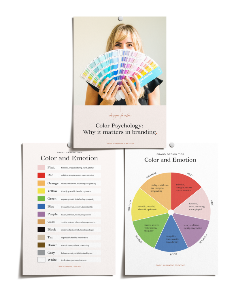
Understand Color Psychology
Colors impact emotions in different ways. For example, blue creates a sense of trust, green signals health and growth, and red stirs energy and passion. Pick colors that reflect your brand’s values.
Keep It Simple
Stick to a small, cohesive color palette—usually 2-3 primary colors and 2-3 accent colors. Using too many colors can dilute your brand identity and confuse your audience.
Consider Your Audience
What colors resonate with your target audience? A younger demographic might prefer bold, vibrant shades. A more mature audience may lean toward sophisticated neutrals.
Check for Accessibility
Make sure your colors are easy to read and accessible for people with color blindness. Tools like color contrast checkers can help.
Test Your Colors Across Platforms
Ensure your colors look great everywhere. From your website and social media to print materials and packaging. Colors may appear different on screens versus in print.
Look at Competitors
Take a look at what your competitors are doing. You don’t want to blend in—stand out by choosing colors that make your brand unique and memorable.
Think About Cultural Meanings
Different colors have different meanings in various cultures. Make sure your choices consider cultural values and expectations of your target market.
These tips will help you pick colors that not only look good but also support your brand’s message and identity.

Where to use your brand colors
Brand colors should be used consistently across all touch points. This creates a cohesive and memorable brand identity. Here are some key places to use them:
Logo
Your logo is often the first thing people see, so make sure it features your brand colors. This helps with instant recognition.
Website
Use your brand colors in the background, typography, buttons, and navigation. This helps your website feel aligned with your brand. Consistency builds trust and familiarity.
Social Media
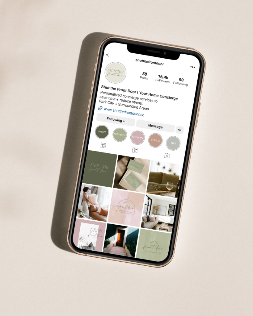
Your social media posts, profile images, and banners should reflect your brand colors. This creates a unified online presence that stands out in feeds.
Packaging
If you have physical products, your packaging is a great way to showcase your brand colors. This helps customers recognize your products on the shelf.
Marketing Materials
Flyers, brochures, posters, and ads should all use your brand colors. This creates visual cohesiveness.
Emails & Newsletters
Use your brand colors in email headers, buttons, and text links. A well-colored email can catch the eye and maintain brand consistency.
Business Cards
Business cards are a small but powerful touchpoint for your brand. Make sure your brand colors are evident, from the card background to the font.
Office Space & Signage
If you have a physical location, integrate your brand colors into your space. This includes interior decor, and signage. This strengthens the brand’s presence and feels more aligned with your identity.
Merchandise
Branded merchandise should use your brand colors. This keeps your identity consistent across physical products.
Presentations
Presentations, reports, and proposals should use your brand colors. These can include charts, graphs, and slides. This keeps your materials on-brand and professional.
Using brand colors consistently helps reinforce your brand’s identity. This ensures your message is visually consistent across all platforms.
How to use your brand colors
Using your brand colors effectively is all about consistency and balance. Here are some tips for using your brand colors consistently.
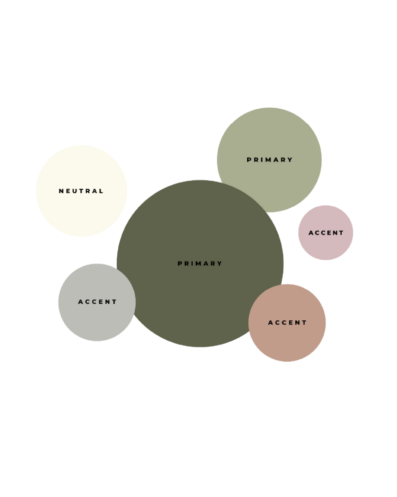
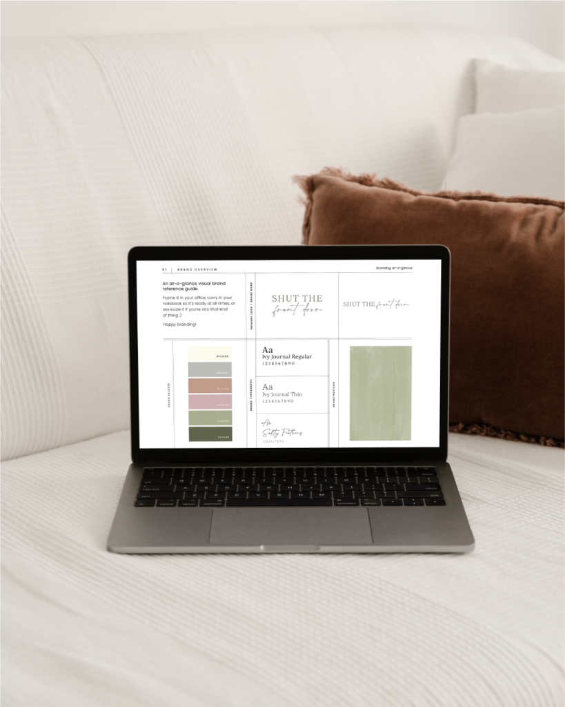
Create a Color Palette
Start by defining a primary color. (This is your brand’s main color). Include a few secondary colors (complementary hues that work well with the primary). Also include neutral colors for balance. This palette will guide your design choices.
Use Colors in Key Areas
- Primary Color: This will be the main color for your brand’s visuals. Including logos, headers, and call-to-action buttons.
- Secondary Colors: Use these for accents, backgrounds, or highlights. Make sure they support the primary color without overwhelming it.
- Neutral Colors: Shades like black, white, or gray balance out more vibrant brand colors. They are great for text or backgrounds.
Establish Color Hierarchy and Proportions
Colors guide your audience’s eye to the most important elements. For example, use your primary brand color for headings or buttons to draw attention. Use secondary colors for less critical elements like background sections. Stick to a ratio for how much of each color you use. A common approach is 60% primary color, 30% secondary color, and 10% accent or neutral. This keeps everything visually balanced.
Consistency Across Platforms
Ensure your brand colors are consistent. Including your website, social media, packaging, marketing, and print materials. The goal is for your audience to immediately recognize your brand no matter where they see it.
Consider Color Combinations
Make sure the colors you choose complement each other. Use the color wheel for guidance. Complementary colors (opposites on the wheel) can create contrast. Analogous colors (next to each other on the wheel) create harmony.
Test for Accessibility
Ensure your brand colors are visible to everyone, including those with color blindness. Use high contrast for text and background combinations. Check accessibility with online tools.
Adapt for Different Contexts
Your colors should look good across various mediums. Colors may appear differently on screens, print materials, and in different lighting. Always test how your brand colors appear in all contexts.
Intentional use of your brand colors will create a strong, unified identity. This builds trust and resonates with your audience.
When it comes to branding, color isn’t just about looking good—it’s about being remembered. People recall colors faster than words or shapes, making a consistent color palette key to building recognition and trust. By using color strategically in your branding and marketing, you can create a lasting impression that sticks with your audience.
Let’s collaborate to craft a thoughtful brand that connects deeply with your audience and sets you apart in the market.

Hi, I'm Cindy. I'm a branding expert who is passionate about health and wellness.
I’m here to help you build a strategic brand that speaks to the hearts and minds of your ideal clients.

