Color Psychology: Why it matters in branding.
Color psychology is the study of colors and how they influence emotions.
Color is fundamental to our experiences and perceptions of the world around us. Colors have a lasting impression and elicit a wide range of emotions. Color psychology is important to consider when creating your branding.
Colors are remembered more than words or shapes. Consistent use of brand colors will help you be more memorable, and trustworthy.
Color is influential in the customer journey. Customers make judgments and associate characteristics based on color. Remember to explore cultural considerations and use appropriate colors.
Emotions of Color
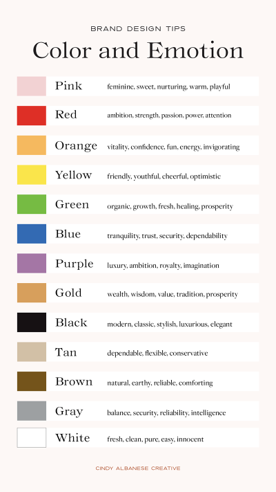
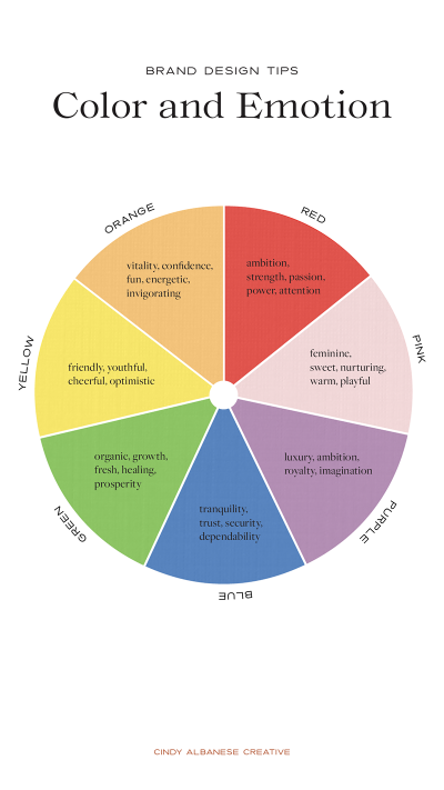
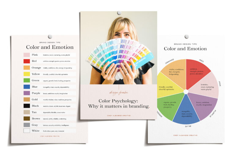
Each color on the color wheel evokes certain emotions. Here are a few examples:
Pink – feminine, sweet, nurturing, warm, affectionate, gentle, compassionate, sensual and playful.
Red – ambition, strength, passion, power, attention, love, attention, urgency and excitement.
Orange – vitality, confidence, fun, energy, invigorating, creative, curiosity, fun, lively and cheerful.
Yellow – friendly, youthful, cheerful, optimistic, happy and warm.
Green – organic, fresh, healthy, healing, growth, balance, giving, prosperity, sustainable and relaxing.
Blue – tranquility, trust, security, dependability, patience, wisdom, loyalty, integrity, stability and honesty.
Purple – luxury, ambition, royalty, imaginative, intuitive, sensitive, spiritual and regal.
Black – modern, classic, stylish, luxurious, elegant, dramatic, formal, elegant and sophisticated.
Gray/Grey – balance, security, reliability, intelligence, graceful and sleek.
Gold – wealth, wisdom, value, tradition, prosperity, tradition and success.
Brown – natural, earthy, reliable, comforting, longevity, stability, dependable, organic and sustainable.
Tan – dependable, flexible and conservative
White – fresh, clean, pure, easy, innocent, goodness, timeless and minimal.
Use of Color
When exploring colors for your brand a good place to start is with color theory.
Color theory is a set of principles used to create harmonious color combinations. It explores the relationship of how colors interact with each other. It includes mixing of colors, value and contract.
A color wheel can help you understand color theory. The color schemes include primary, secondary and tertiary colors.
Other color schemes include monochromatic, complementary, split-complimentary, analogous, triadic and tetradic colors.
Seasons of Color
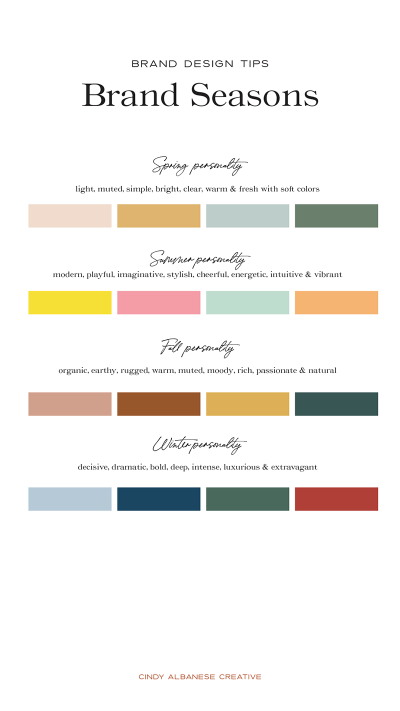
The four seasons of color are spring, summer, fall (autumn) and winter. There are colors and personalities associated with each of these seasons.
The Spring personality is light, muted, simple, bright, clear, warm and fresh.
The Summer personality is modern, playful, imaginative, stylish, cheerful, energetic, intuitive and vibrant..
The Fall personality is organic, earthy, rugged, warm, moody, rich, passionate and natural.
The Winter personality is cool, decisive, dramatic, deep, intense, luxurious and extravagant.
Discover which season aligns with your brand. This allows you to create a more cohesive color palette.
Keep in mind, some brands can include more than one season.
Using color psychology is a great framework to understand how colors influence emotions.
It provides guidance and structure to help create cohesive designs.
It helps you to understand why some colors work together and some don’t.
The goal of your brand is to create connections and elicit emotions, which will then build trust. This trust compels customers to buy from you instead of someone else.
Help make informed decisions for color choices and how they will influence perceptions. Creating a harmonious color palette will be fundamental for your brand.
Use this free guide to get you started.
Send me the free guide
Color Psychology and why it matters in branding.

